Project Goal
Create a complete UX design for the “Manage Trees with Folders” feature is to improve the usability and user experience of the decision tree management system. Specifically, the goal is to help users easily organize and manage hundreds of their decision trees scripts by providing them with a clear and intuitive folder system.
Design Process
The first thing I did was a clear definition of what needs to be done The design should aim to make it simple for users to create new folders, move trees between folders, and delete folders as needed. The overall interface should be visually appealing and easy to navigate, with clear and concise instructions provided to help users understand how to use the feature. Additionally, the design should ensure that users can easily access and view their decision trees within the folder system. Overall, the goal of the UX design was to enhance the user’s ability to manage and utilize their decision trees efficiently and effectively.
The UX design should prioritize the following:
- Clear Information Architecture: The design should provide a clear and easy-to-understand structure for organizing decision trees into folders. Users should be able to easily navigate through the folders and access their trees.
- Intuitive Interaction Design: The design should provide clear and intuitive controls for creating, renaming, and deleting folders, as well as for moving trees between folders. Users should be able to perform these actions without confusion or frustration.
- Consistent Visual Design: The design should be consistent with the overall visual design of the product. This includes typography, colors, and iconography.
- Accessibility: The design should take into account accessibility best practices, such as providing sufficient color contrast and using semantic markup for screen readers.
- User Testing: The design should be tested with real users to ensure that it meets their needs and expectations. This includes testing the information architecture, interaction design, and visual design.

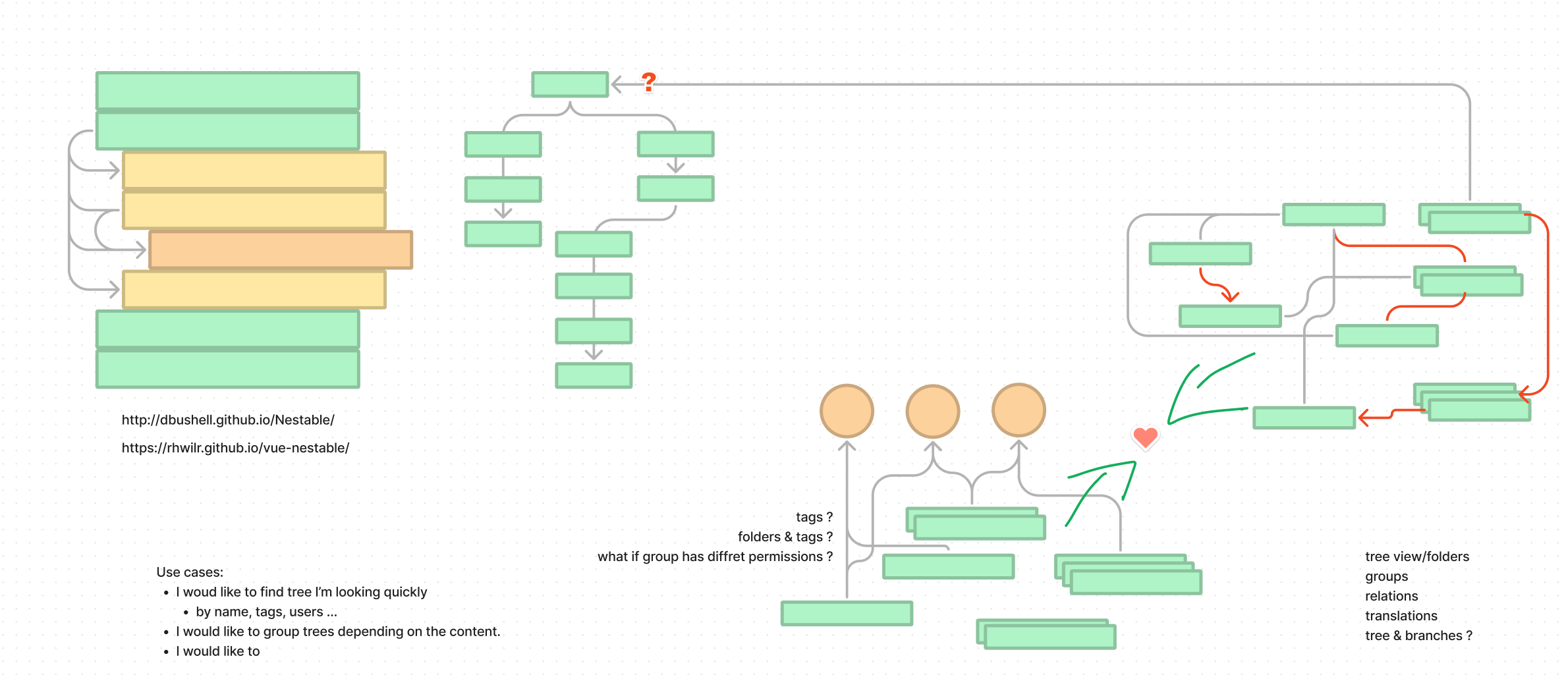
To begin the project, I collaborated with the entire product team to define the feature requirements and understand the user needs. I’ve conducted user research to gather as much feedback and data to identify pain points in the current tree management process to confirm and define the design frames.
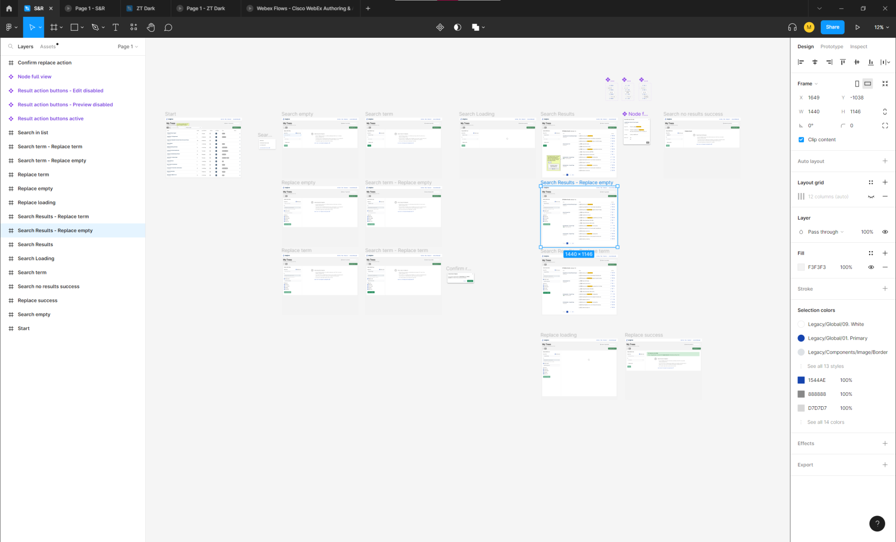
Based on this research, I’ve created wireframes and prototypes of the feature using “Figma”. This design software allowed me to create a fully interactive design that accurately represents the final product. With this we could test it, gather feedback and make necessary adjustments to the design. This process helped ensure that the final design met the needs of the users and was easy to use.
Visual Design
The visual design of the “Manage Trees with Folders” feature was kept simple and clean to avoid overwhelming the user with too much information. The design includes a clean and intuitive drag-and-drop interface, making it easy for users to manage their decision trees.

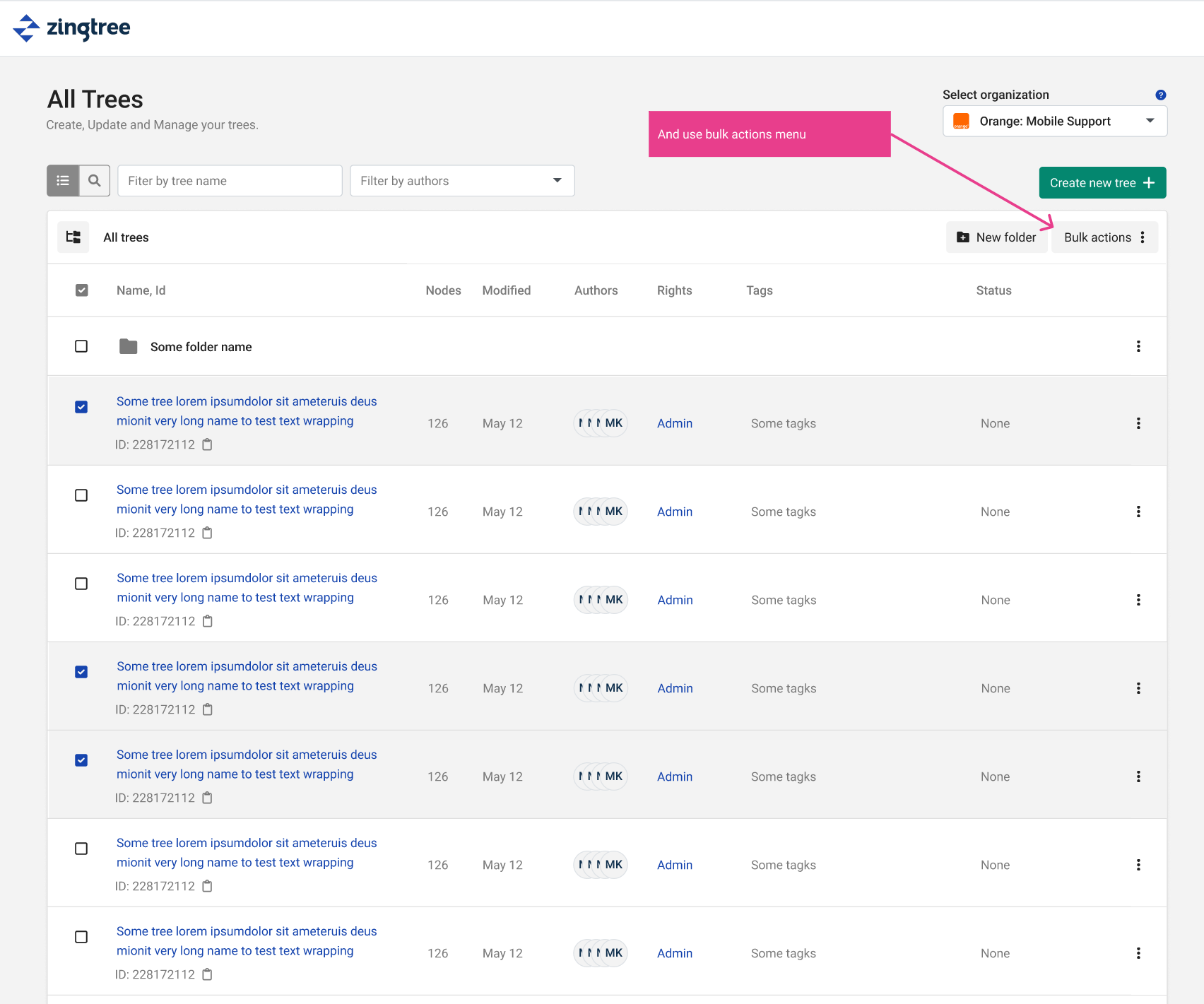
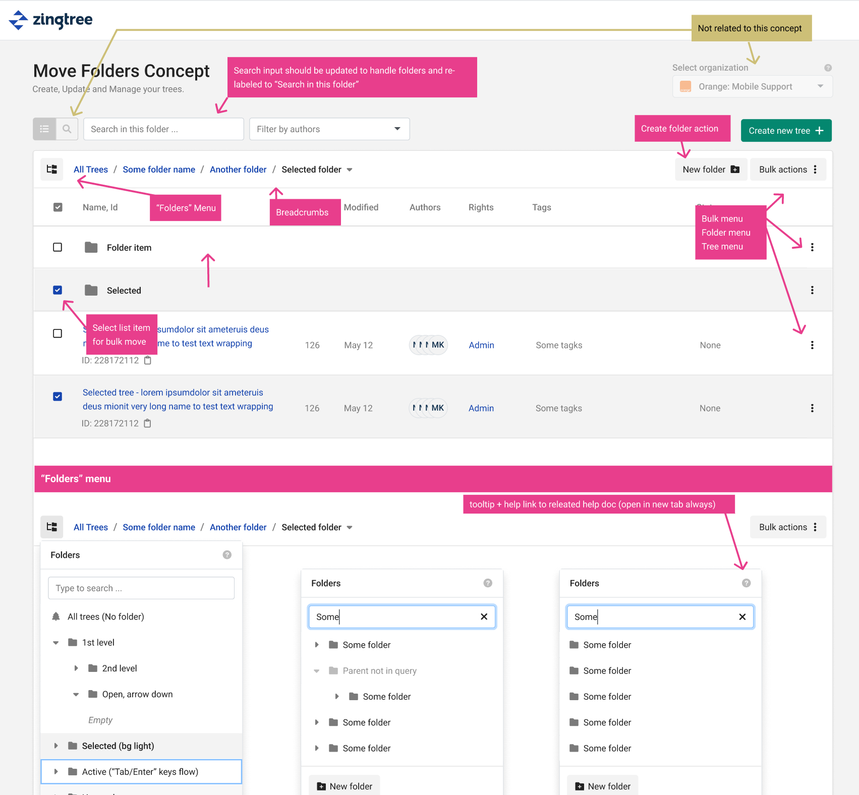
To illustrate this project, I included screenshots of the folder management interface and the process of creating a new folder. These visuals help users understand how the feature works and how to use it effectively (below).
Implementation

Once the design was finalized, it was handed over to the development team for implementation. The feature was integrated into Zingtree.com and went through rigorous testing to ensure that it was working as intended.
Conclusion
Overall, the “Manage Trees with Folders” feature was a successful project that improved the user experience on Zingtree.com. By designing a feature that addresses the needs of the users, we were able to create a tool that helps users manage their decision trees more effectively. The project was a great example of collaboration between design, product, and development teams, resulting in a valuable feature that benefits the users.
As a UX designer, I designed a feature for Zingtree.com that allows users to manage their decision trees with folders. This feature was created using Figma, a design software that allowed for a fully interactive design process.
Overall, the project was successfully implemented on Zingtree.com and has received positive feedback from users who find it helpful in managing their decision trees more efficiently.
Read more about this project on Zingtree blog: https://help.zingtree.com/hc/en-us/articles/9816116002203-Manage-Trees-with-Folders
See more of my work for Zingtree …

“I’d recommend Marcin for many opportunities and think he’s a great person to help accelerate work, especially in SaaS companies that need a combination of UX + FE code work done.“