Defining the Problems:
Assembla is a project management tool used by software development teams. However, users were getting lost in the app and had difficulty determining in which organization they were currently working. Additionally, users had to do a lot of clicks and page reloads to move from one part of the project to another. The tools in the project menu were poorly organized and hard to find. The projects had similar problems as tools, and the position of the projects could vary with the width of the screen. Using the app on mobile devices was a nightmare, and there were no breadcrumbs. The primary goal was to remove user confusion and make getting from one thing to another faster.
Setting Goals:
To reach the set goals, Assembla conducted research using in-app data, analytics, surveys, and interviews. Based on the research, Assembla came up with a concept that assumed organizing everything in order. The concept assumed a top bar as navigation for organization level, with the left side related to projects and the right side related to the current user. A brand new “Other Companies” button was also added, allowing users to quickly get to other SaaS companies under the Idera label. Assembla aimed to organize everything in a logical and intuitive manner while maximizing the work area.
Low Fidelity Concepts:
Assembla created simple, clickable, and interactive low-fidelity mockups to test the feel of the changes with small effort. For the organization level, Assembla created a left side vertical menu, which held a lot of tools, organized in logical sections. They added additional dropdown menus, allowing users to directly go to a selected view without going through unnecessary pages. Assembla added quick search for tools and repositories and breadcrumbs. They also added an option to “favorite” a project or repo to keep it at the top.
Reviews, Dry Testing, and Iteration Changes
Assembla ran the concept through the dev team, managers, Assembla team members, some friendly users, and even their girlfriend. After each test, they made small changes and adjustments, pulling all important items and flows to the top. It was an iterative process that aimed to capture all aspects of user requirements.
Hi Fidelity Mockups and Final Review
Assembla created high-fidelity interactive mockups based on the reviews. Again, they went through the review process without any more comments. The mockups captured the essence of the requirements and showed a clean, uncluttered interface that met user needs.
Implementation
Assembla created a detailed project requirements document that included all the concepts and details listed in a dev-friendly fashion, mostly as checklists. The implementation was technically super simple and light to avoid overworking the browser. Assembla created a “pure html/css” draft before starting in-app implementation to ensure the developers had no issues with the layouts. They also ensured keyboard navigation was fully supported.
Costs and Results:
Thanks to good planning, the implementation was easy and did not require significant development resources. The implementation was free from any UX mistakes or issues, and it was the most appreciated update to the app to date.
Assembla captured a massive drop in user confusion, and all major user flow steps were reduced to a minimum. They captured a huge drop in plain page loads and improved mobile accessibility.
The new navigation update was the most appreciated by the Assembla’a customers feature up-to-date.

I highly recommend Marcin as a UX and product designer. With extensive experience and a deep understanding of analytics-based design, Marcin has a unique ability to create designs that truly resonate with customers.
Assembla’s New Navigation Features
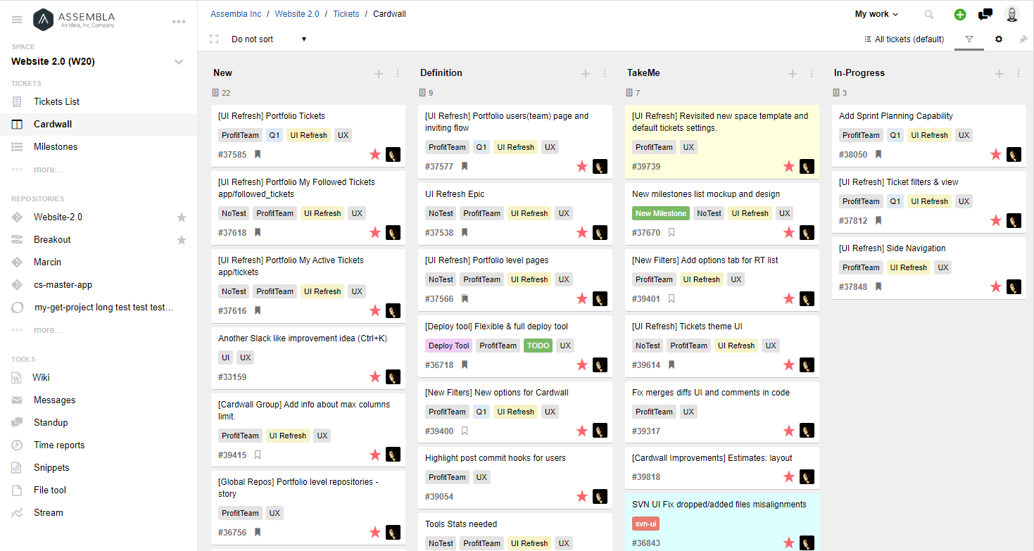
New Top Bar Menu
The top navigation bar has been reworked and now includes all spaces and repositories lists and all the portfolio level pages together with user personal pages.

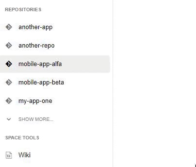
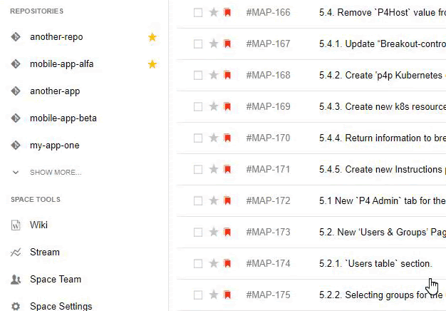
The new repository dropdown allows direct access to selected code repo without choosing a space first. All lists can be also easily filtered and any space or repository may be marked as “Favorite” which will pin this item on the top of the list. The same can be done for project spaces. This way you can keep your current work on the top in a simple and efficient way.

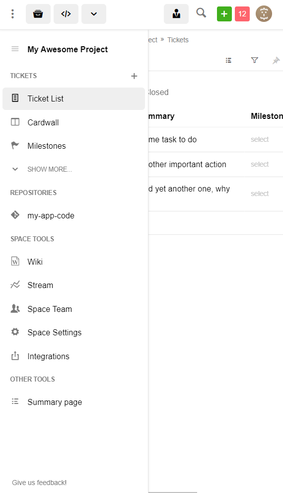
New “Space” Sidebar Menu
All space level tools are now collected inside the new side navigation bar and arranged into sections. Sidebar can be minimalized to the icon bar, as well as “pinned” to become active on mouse hover.

Tickets tool pages have been moved one level higher and are now accessible in the space menu. This means that all sub pages of the tickets tool ( Cardwall, List, Milestones, … ) are now available from any place in the space.

Repositories section is now searchable so even in the project with a huge amount of code repos you will have no problem finding what you need.
Space Repository Menu
The repositories tools now have an additional menu where you can select it’s subpage without a need to open the selected repository tool first. It will allow for example to jump straight from your tickets view to the selected repo merge requests page.
Keyboard navigation
You can navigate through all the options using your keyboard only, as the layout fully supports default “tab/shift+tab/enter” functionality, moreover all searchable fields may be selected by typing and using “up/down arrow” and “enter” keys.
Start using new navigation.
The new navigation is currently released under the “feature flag”, to start using it click the “Try New Side Navigation” link in your user options menu.

The most significant change is the new “Project Space” sidebar which collects all of the project space tools and pages in one easily accessible location. . The sidebar may be minimalized or “pinned” to become active on mouse hover. Everything you need is just one click away.
We’ve added the “Portfolio” level and all “personal” user pages to the top navigation.. Our customers will appreciate the new “Repositories” dropdown which allows access to any repo from any place in the application.
The Project Space and Repository menus are now fully searchable to allow users to quickly find access to what they are looking for.

New navigation significantly simplifies all main use cases and users flows allowing teams to find and collaborate on their work faster and easier.